
IELTS Academic Writing Task 1
Bar Graphs
The percentage is of minute women in employment in free countries between 2005 and 2015.
Summarize information by selecting and reporting the main features and make comparisons where relevant.
Write at least 150 words.

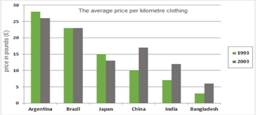
The average price per kilometre of clothing imported into the European union from six different countries in 1993 and 2003 are shown in the chart below.
Summarize information by selecting and reporting the main features and make comparisons where relevant.
Write at least 150 words.
The average price per kilometre of clothing imported into the European union from six different countries in 1993 and 2003 are shown in the chart below.
Summarize information by selecting and reporting the main features and make comparisons where relevant.
Write at least 150 words.
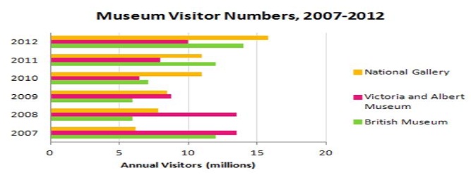
The bars chart shows the number of visitors to the London Museums between 2007 and 2012.
Summarize information by selecting and reporting the main features and make comparisons where relevant.
Write at least 150 words.
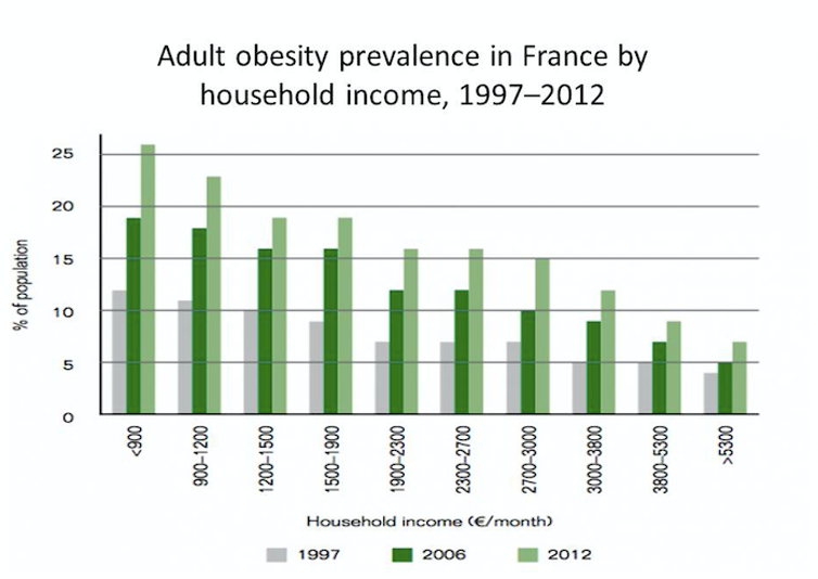
The graph shows the increase in obesity among adults of France in comparison to their income during 1997 to 2012.
Summarise the information by selecting and reporting the main features, and make comparisons where relevant.
You should write at least 150 words.
Line Graphs
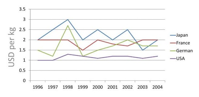
The line graph shows the number of bananas imported to four countries during 1996 to 2004.
Summarize information by selecting and reporting the main features and make comparisons where relevant.
Write at least 150 words.
The graph below shows the average carbon dioxide emissions per person in United Kingdom's within Italy and Portugal between 1967 and 2007.
Summarize information by selecting and reporting the main features and make comparisons where relevant.
Write at least 150 words.

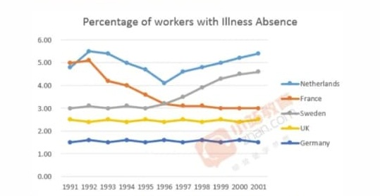
The graph below shows the percentage of workers in five different European countries with a day or more illness absence from 1991 to 2001.
Summarize information by selecting and reporting the main features and make comparisons where relevant.
Write at least 150 words.
The graph below shows the number of tourists visiting a particular Caribbean island between 2010 and 2017.
Summarize information by selecting and reporting the main features and make comparisons where relevant.
Write at least 150 words.

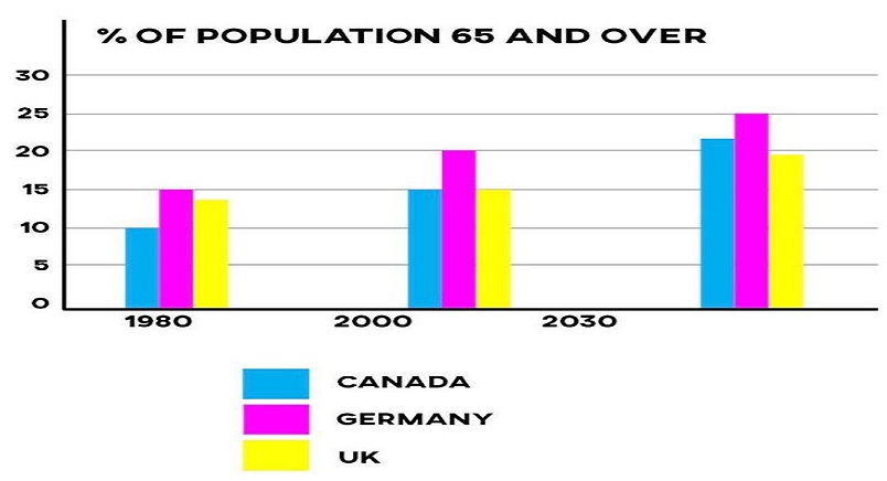
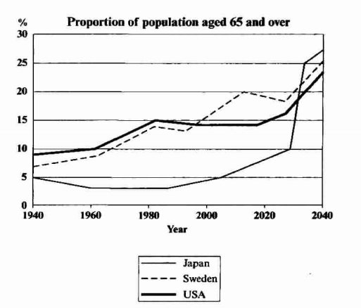
The graph below shows the proportion of population aged 65 and over between 1940 and 2040 in three different countries.
Summarise the information by selecting, and reporting the main features and make comparisons where relevant.
Write at least 150 words.
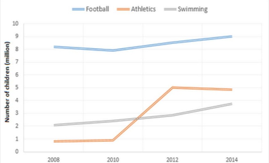
The graphs below show the average monthly expenditure on children’s sports and participation in different sports in the UK from 2008 to 2014.
Summarise the information by selecting and reporting the main features, and make comparisons where relevant.
You should write at least 150 words.
Pie Charts
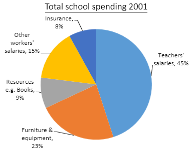
The three pie charts below show the changes in annual spending by a particular UK school in 1981, 1991 and 2001.
Summarise the information by selecting and reporting the main features, and make comparisons where relevant.
You should write at least 150 words.
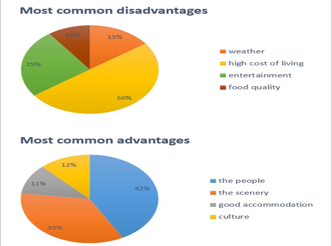
The pie charts below show the most common advantages and disadvantages of Bowen Island according to a survey of visitors.
Summarise the information by selecting and reporting the main features, and make comparisons where relevant.
You should write at least 150 words.
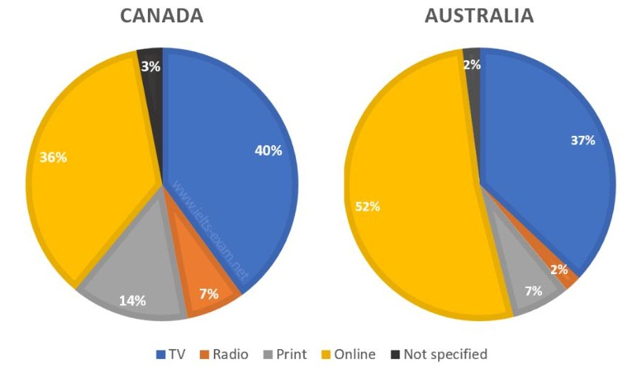
The pie charts compare ways of expressing the news in Canada and Australia.
Summarise the information by selecting and reporting the main features, and make comparisons where relevant.
You should write at least 150 words.
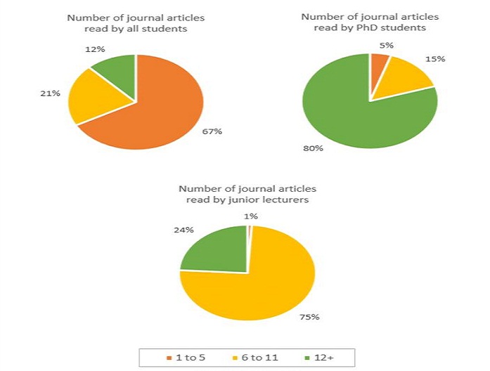
The pie charts given below show the number of journal articles read per week by all the students, PhD students and junior lecturers at an Australian university.
Summarise the information by selecting and reporting the main features, and make comparisons where relevant.
You should write at least 150 words.
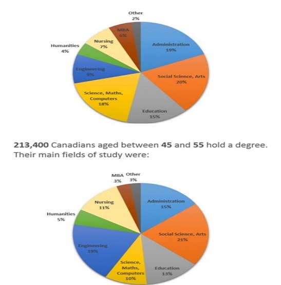
The charts below show the post-school qualification held by Canadians in the age group 25 to 35 and 45 to 55.
Summarise the information by selecting and reporting the main features, and make comparisons where relevant.
You should write at least 150 words.
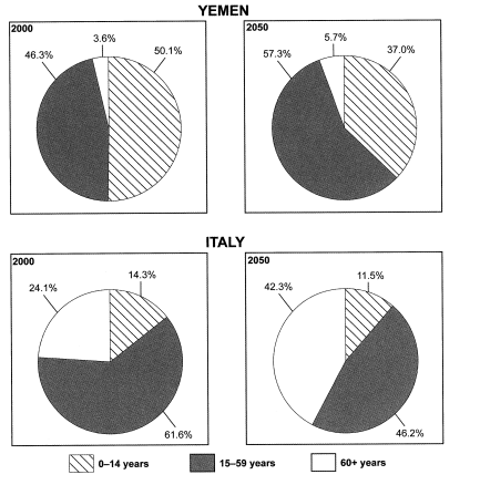
The charts below give the information on the ages of population of Yemen and Italy in 2000 and projections for 2050.
Summarise the information by selecting and reporting the main features, and make comparisons where relevant.
You should write at least 150 words.
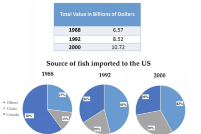
The pie charts and table give information about the total value of sources of fish imported to the US between 1988 and 2000.
Summarise the information by selecting and reporting the main features, and make comparisons where relevant.
You should write at least 150 words.
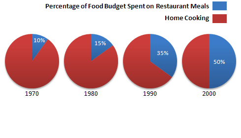
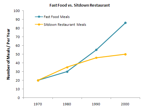
The charts below show the percentage of food budget, an average family spent on restaurant meals in different years. The graph shows the number of meals eaten in fast food restaurants and sit-down restaurants.
Summarise the information by selecting and reporting the main features, and make comparisons where relevant.
You should write at least 150 words.
Maps
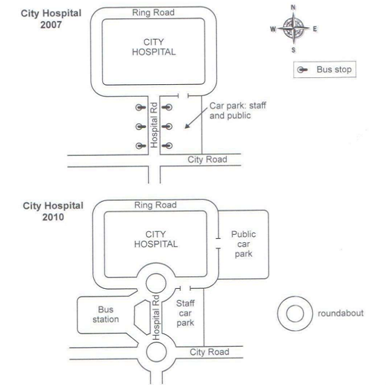
The two maps below show road access to a city hospital in 2007 and in 2010.
Summarise the information by selecting and reporting the main features, and make comparisons where relevant.
You should write at least 150 words.
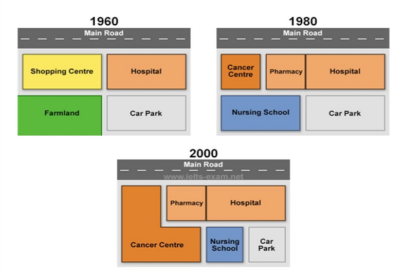
The maps below show the changes that have taken place at Queen Mary Hospital since its construction in 1960.
Summarise the information by selecting and reporting the main features, and make comparisons where relevant.
You should write at least 150 words.
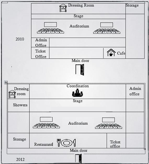
The plans below show theatre in 2010 and 2012.
Summarise the information by selecting and reporting the main features, and make comparisons where relevant.
You should write at least 150 words.
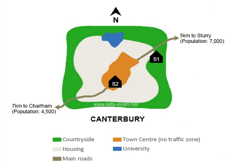
The map below is of the town of Canterbury. A new school, S is planned for the area. The map shows two possible sites for the school.
Summarise the information by selecting and reporting the main features, and make comparisons where relevant.
You should write at least 150 words.
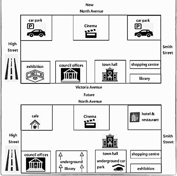
The maps below show a civic centre between the present and its future plan.
Summarise the information by selecting and reporting the main features, and make comparisons where relevant.
You should write at least 150 words.
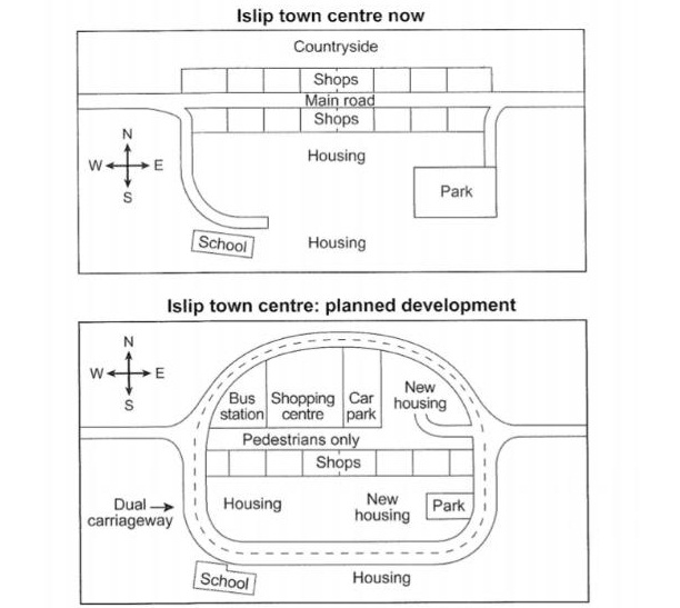
The maps below show the centre of a small town called Islip as it is now, and plans for its development.
Summarise the information by selecting and reporting the main features, and make comparisons where relevant.
You should write at least 150 words.
Table
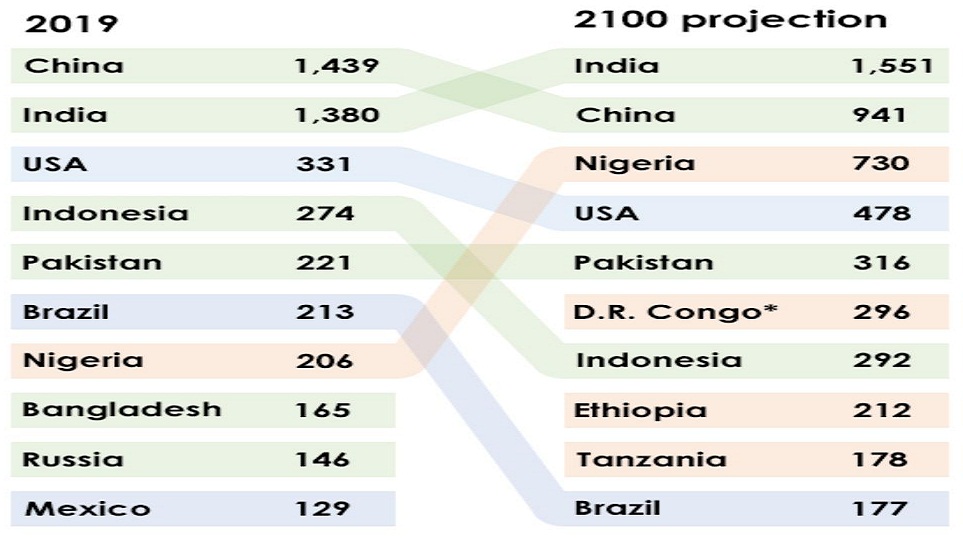
The table below shows the top ten countries with the largest population in 2019 and how it is projected to change by 2100.
Summarise the information by selecting and reporting the main features, and make comparisons where relevant.
You should write at least 150 words.
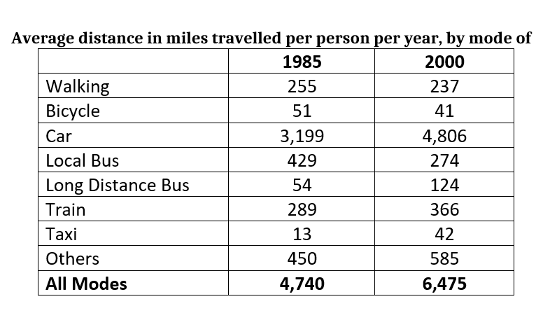
The table below gives information about changes in modes of travel in England between 1985 and 2000.
Summarise the information by selecting and reporting the main features, and make comparisons where relevant.
You should write at least 150 words.
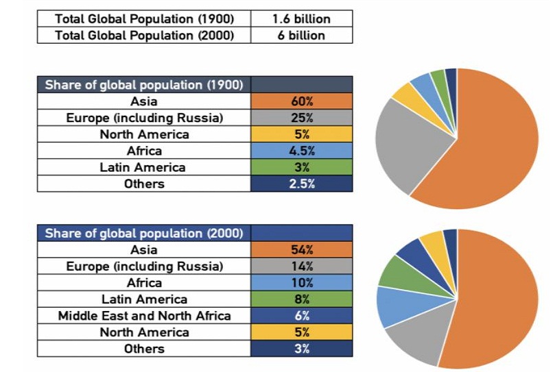
The table below show the changes in world population by region between 1900 and 2000.
Summarise the information by selecting and reporting the main features, and make comparisons where relevant.
You should write at least 150 words.
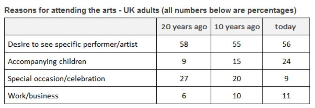
The table below shows the results of 20 years study into why adults in the UK attended arts events.
Summarise the information by selecting and reporting the main features, and make comparisons where relevant.
You should write at least 150 words.
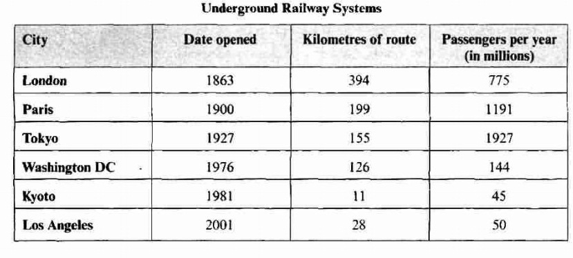
The table below shows information about the underground railway systems in six cities.
Summarise the information by selecting and reporting the main features, and make comparisons where relevant.
You should write at least 150 words.
Flow charts
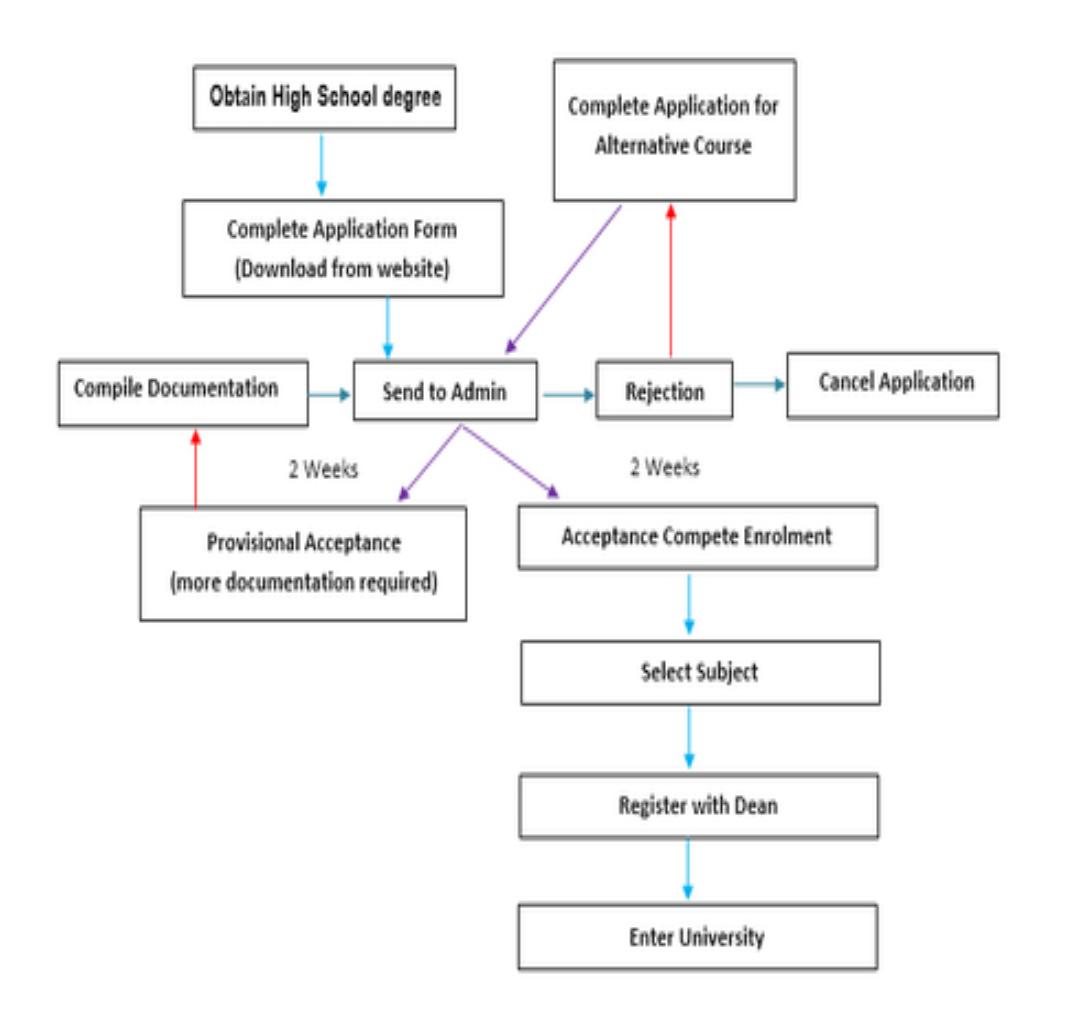
The diagram below shows the procedure of university entry for high school graduates.
Summarise the information by selecting and reporting the main features, and make comparisons where relevant.
You should write at least 150 words.
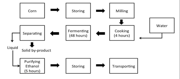
The diagram below shows how ethanol is produced from corn.
Summarise the information by selecting and reporting the main features, and make comparisons where relevant.
You should write at least 150 words.
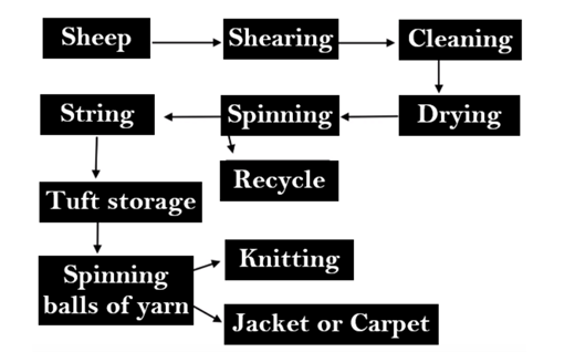
A flow chart shows the process of making wool.
Summarise the information by selecting and reporting the main features, and make comparisons where relevant.
You should write at least 150 words.
The flowchart below shows the process involved in completing the work experience requirement for university students.
Summarise the information by selecting and reporting the main features, and make comparisons where relevant.
You should write at least 150 words.

Process/Diagram
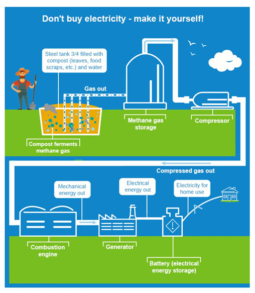
The diagram shows a possible future means of form energy production.
Write a report for university, lecturer describing that information shown below.
Summarise the information by selecting and reporting the main features, and make comparisons where relevant.
You should write at least 150 words.
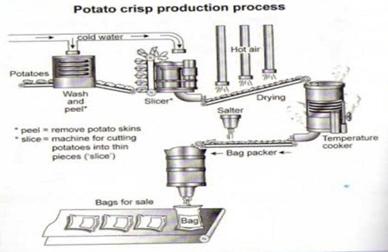
The diagram below shows the process of making potato crisps.
Summarise the information by selecting and reporting the main features, and make comparisons where relevant.
You should write at least 150 words.
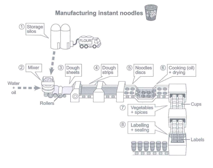
The diagram below shows how instant noodles are manufactured.
Summarise the information by selecting and reporting the main features, and make comparisons where relevant.
You should write at least 150 words.
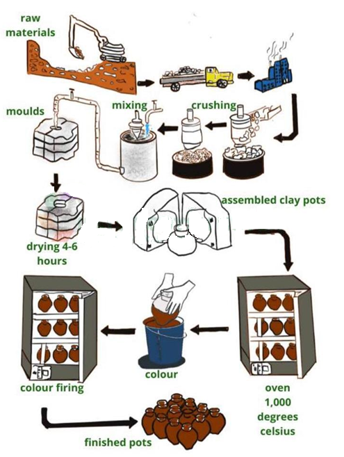
The diagram below shows a method of manufacturing ceramic pots.
Summarise the information by selecting and reporting the main features, and make comparisons where relevant.
You should write at least 150 words.
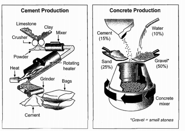
The diagrams below show the stages and equipment used in the cement making process and how cement is used to produce concrete for building purposes.
Summarise the information by selecting and reporting the main features, and make comparisons where relevant.
You should write at least 150 words.
Cycle
The diagram below shows the life cycle of the honeybee.
Write a report for university, lecturer describing that information shown below.
Summarise the information by selecting and reporting the main features, and make comparisons where relevant.
You should write at least 150 words.

The diagram below shows the recycling process of aluminium cans.
Summarise the information by selecting and reporting the main features, and make comparisons where relevant.
You should write at least 150 words.

The diagram below shows the life cycle of a salmon, from egg to adult fish.
Summarise the information by selecting and reporting the main features, and make comparisons where relevant.
You should write at least 150 words.

The diagram below shows the environmental issues raised by a product over its life cycle.
Summarise the information by selecting and reporting the main features, and make comparisons where relevant.
You should write at least 150 words.

Join Our Online classes for more Question Type specified Tips and Tricks
